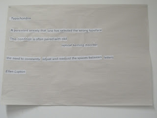
So we had a typo session just after going out to view Lou Dorfman's typographic wall, which was great and got my mind working in that direction. We started off with a group activity in which our group had to eliminate the smallest element from a paragraph. So our group decided that a dot, be it a full stop, colon, or the dot on and i.
Then we had our own fun with letters. We traced over a letter of our choice and then reconstructed it in a number of ways.
Here are the images of some of the work I liked.
The next part I loved, and kinda hated. Loved because the end result was nice to look at, and hated because all the tracing was getting on my nerves. It took some patience but I did finally get through.
I went a little experimental on the placing of the letters, I think it may have worked on my first name but not so much on my surname. Maybe just having the H and the dot of the i in a different colour would have been enough. I did like Ingmar's work though.
The T just came right under the g and the m which are kind of at the centre of his name first name, which creates an underline for his name. Also I could definitely see that on an office door.
Finally we finished with an exercise in which we used different approaches to express the meaning of the words chosen.


No comments:
Post a Comment